Making a Better Map Part 1: Getting Data with TidyCensus
Recreating a Visualization
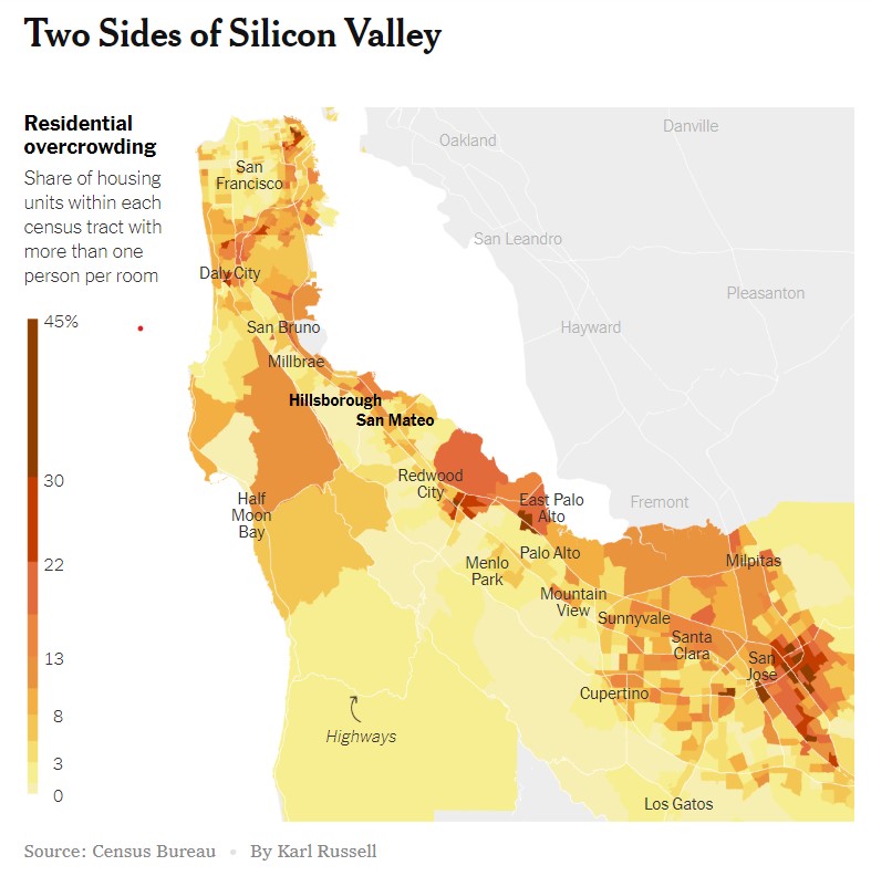
One of the many perks of having Data Science skills is being able to interact with statistics and graphs that you see in the news in a much deeper way. This weekend’s New York Times included an interesting graphic on housing density and overcrowding in the Bay Area:

My goal in this project is to 1) Recreate the original visualization using census data. 2) Build a function to generate similar maps for any region of the country.
Setup
Fortunately the graphic cites its sources. I’m going to use tidycensus package to grab the base data and the ggplot2 library for my visual output. Since I’m sure I’ll also be needing dplyr and som other common tools to boot, I’ll bring in the whole tidyverse package as well.
library(tidycensus)
library(tidyverse)
Getting to the data
The good news is that the tidycensus package makes it a snap to get recent census data without even having to write and load any csv files to your working directory. The bad news is that census data is extremely complex and detailed and we will have to do a bit of sleuthing to find the inputs we’ll need to recreate the graphic. For this part of the project I found Kyle Walker and Matt Herman’s tidycensus vignettes to be of incredible help.
You’ll want to have a census API key in order to access the data. It’s free and easy to register so no worries there. Tidycensus has a built in function for storing your key.
census_api_key("YOUR API KEY GOES HERE")We’ll be using the 2018 American Community Suervey (ACS) data since that’s the most recent available. Let’s have a look at what data is available.
acs = load_variables(2018, 'acs5', cache = TRUE)
summary(acs)
## name label concept
## Length:26996 Length:26996 Length:26996
## Class :character Class :character Class :character
## Mode :character Mode :character Mode :characterThat’s …. a lot of categories: nearly 27000 rows! After some extensive sleuthing and googling to get a better sense of census jargon I concluded that the TENURE BY OCCUPANTS PER ROOM category is what we want. The job now is to query that subset of categories for the geographic area we want to map. Since our goal is to recreate the New York Times map, I’m going to use a list of bay area counties. In our get_acs() call we’ll want to specify that we want tract level data with geometry shapefiles included since this is ultimately going to power our map.
my_state = 'CA'
my_county = c('San Francisco','San Mateo','Santa Cruz','Santa Clara','Alameda','Contra Costa')


  concepts = acs %>%
    filter(concept == 'TENURE BY OCCUPANTS PER ROOM')

  concepts_string = concepts %>%
    select(1) %>%
    pull() # this creates a character vector of just the concepts we want

raw =  get_acs(geography = 'tract', variables = concepts_string, year = 2018, state = my_state,
              county = my_county,geometry = TRUE, cache = TRUE)
Transforming and Aggregating
Now we have our raw data! It’s got some issues though: First there’s multiple rows for each Census tract that we will want to aggreage in order to make our map. Also the return from the census API includes our variable codes but does not contain friendly labels that our human brains can easily parse. I’ll consolidate every tract ID using the spread() function and then join our original list of concepts back in for easier reading. I’m also going to clean up the column names a bit using the make_names() function that is built into base R.
fixed_data = concepts %>%
  select(name, label) %>%
  right_join(raw, by = c('name' = 'variable')) %>%
  select(2,3,5,7) %>%
  spread(key = label, value = estimate, -4)

names(fixed_data) = make.names(names(fixed_data))
That gives us a nicer dataframe to work with. The last step is to do some basic arithmetic with our columns to figure out the ratio of households with more than one occupant per room. I just used basic dplyr mutates for this, which is a little inelegant but gets the job done. You may find a better solution exists.
fill_data = fixed_data %>%
  mutate(
    total_under_1 = Estimate..Total..Owner.occupied..0.50.or.less.occupants.per.room + Estimate..Total..Owner.occupied..0.51.to.1.00.occupants.per.room +    Estimate..Total..Renter.occupied..0.50.or.less.occupants.per.room + Estimate..Total..Renter.occupied..0.51.to.1.00.occupants.per.room,
    total_over_1 = Estimate..Total..Owner.occupied..1.01.to.1.50.occupants.per.room + Estimate..Total..Owner.occupied..1.51.to.2.00.occupants.per.room +    Estimate..Total..Owner.occupied..2.01.or.more.occupants.per.room + Estimate..Total..Renter.occupied..1.01.to.1.50.occupants.per.room + Estimate..Total..Renter.occupied..1.51.to.2.00.occupants.per.room + Estimate..Total..Renter.occupied..2.01.or.more.occupants.per.room
    ) %>%
select(GEOID,geometry ,total_under_1, total_over_1, Estimate..Total) %>%
mutate(ratio_over_1 = total_over_1/ Estimate..Total)

head(fill_data)
## # A tibble: 6 x 6
## GEOID geometry total_under_1 total_over_1 Estimate..Total
## <chr> <MULTIPOLYGON [°]> <dbl> <dbl> <dbl>
## 1 0600~ (((-122.2469 37.88544, -~ 1285 12 1297
## 2 0600~ (((-122.2574 37.8431, -1~ 849 6 855
## 3 0600~ (((-122.2642 37.84, -122~ 2375 66 2441
## 4 0600~ (((-122.2618 37.84179, -~ 1718 32 1750
## 5 0600~ (((-122.2694 37.84811, -~ 1575 47 1622
## 6 0600~ (((-122.2681 37.84414, -~ 653 4 657
## # ... with 1 more variable: ratio_over_1 <dbl>Now we’ve got a data frame with one row for each census tract that contains a shapefile for the contours of the tract, plus a calculation of the percentage of housing units that have more than one occupant per room. We’ll cover making the map using ggplot in Part Two.
